Our team still remembers the great cooperation with Hainlin, the official Kyocera online shop, as if it were only yesterday. A few years ago, the trading platform was relaunched on the basis of the then fresh OXID Azure template. In the meantime, a few years have passed and the ravages of time gnawed away at the shop design, the decision was made to use a responsive template. The responsive OXID template was realised with the Bootstrap Grid System and was to be closely based on the design of the previous shop, but significantly modernised.
Why did we decide to sell with OXID responsive & optimised for mobile devices?
The world and its shopping behaviour has changed a lot in recent years. People no longer just shop at home on their PC but wherever they are. Whether on the train or in a restaurant, by quickly reaching for a tablet or smartphone, we are sometimes closer to our customers than we think.
In the media and for the general public, the surfing behaviour of the younger generations is still met with scepticism. To buck this attitude is completely wrong. For younger generations, both now and in the future, shopping and paying via mobile devices and mobile internet is part of their standard of living and holds a potential they should not turn their backs on.
Both from the point of view of usability for the customer and because of the mobile-optimised search results pages introduced by Google, the decision fell on an OXID responsive template. Our customers and not least Google thank us for this change.
What is the difference between OXID responsive & non-responsive?
Everything is still very new and fresh, in the coming weeks we will receive more precise values via statistics, but in the last few days a significant increase in buyers on mobile devices could be recorded. Of course, this is good news for us and we are pleased that the visitors are happy with the improved responsive interface.
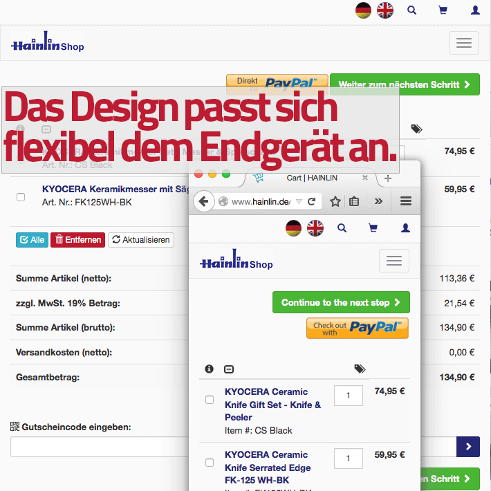
Especially in the tablet area, the shop is wonderful to use, the shop design automatically adapts to the display depending on the inclination and you have an incredibly great shopping experience. The design of the system is specially adapted to the presentation of kitchen products and displays them in a high-quality manner on every end device.
The difference between operating OXID in a responsive or non-responsive manner is clearly evident on smartphones. Conventional websites are displayed very compressed or zoomed on the very small displays, whereas OXID responsive uses the display exactly and shows the customer images and texts in a readable size without loss of quality. Most customers have used our shop on the smartphone only briefly or not at all, and the increasing numbers in Google Analytics confirm our decision to use the OXID responsive template.
Finally, more screenshots of the design of Hainlin.de, the official Kyocera online shop.

If you are interested in running your OXID responsive, the Netensio team is at your disposal.